Thursday, 14 June 2012

2012 Royal Academy Summer Exhibition

The Lovely Husband is between contracts, in other words, an impromptu and slightly unexpected (but welcome all the same) unpaid holiday of a couple of weeks.  Due to the fact that we are the custodians of a creaky old cat who grumps about the place and shouts a great deal, we can't really go anywhere for longer than a day or so.  Plus I don't want to impose cat-feeding duties on friends or family because it's not really as simple as that - he occasionally needs medication for his hobbly, arthriticky old joints but you need to keep an eye on him throughout the day to determine whether he could benefit from a dosing or not, plus there's the horrors of the litter tray and the sweeping up of the cat litter that he flicks everywhere.  And I worry about him so, on the whole, it's easier for us if we don't go on holiday.  Ever again.  Until he goes to his eternal reward.  Which could be years away - although he's 16 now and can't last forever.  *sigh*.

So we make do with day trips from time to time, and this week we decided we'd go to the 2012 Royal Academy's Summer Exhibition.  We didn't go at all last year (can't remember why not), but we did in 2010 and I did a big post about it which you can read here.  Interestingly, that post is the second highest read of all my blog posts with 2,339 views (the highest is the one on How to Make Blackberry Vodka which is still the first result you get back on Google when you enter the title as search terms - it's been viewed almost 10,000 times!)

As it was such a popular post - and I'd received emails from one or two of the exhibiting artists about it (nice emails, I hasten to add!) - I knew I'd have to do another one this time, again with as many photos as I could cram in.  The problem, of course, with that is that I'm breaking all kinds of copyright laws in a very major way which does make me feel somewhat uneasy but, on the other hand, I'm giving the artists free publicity.  And it naturally goes without saying that if anyone objects or complains, then I'll happily take the photo down - I don't want to ruffle any feathers at all or, come to that, get arrested.  So that's my disclaimer out of the way.

Of course, the Royal Academy doesn't actually allow you to take photos because, naturally, they want punters to either buy the painting/print/artwork or the postcards (which I did) or the catalogue, which means I have to employ ninja stealth tactics to get these pictures by using my iPhone which is more discreet than using my 'proper' camera.  The downside to this is that, unfortunately, quite a few of my pictures this year are a bit more blurred and/or out of focus than I would have liked.

The reason for this is that we didn't go on Buyers' Day this year, which is both a good and bad thing.  It was a bad thing because I quite like the snobbery value of being able to mix with the wealthy and the odd famous (i.e., the Marquis of Bath - he always goes on Buyers' Day and he is most definitely  odd and famous) and not to have paid to get in (they send you a free ticket).  It was also a bad thing because it means you don't get first dibs on a piece you might fancy buying (but as I had no intention of buying this year, that wasn't a concern).  It was also, weirdly, both a good and bad thing in that there were far less visitors on a 'normal' day compared to Buyers' Day, when the place is rammed to the rafters and the place gets as hot as a sauna, and you can't see anything properly because you can't get close enough, so less people = a good thing, a very good thing indeed but less people = less bodies to hide behind when taking the illicit photographs.   When I could hide behind people I had the time to be able to focus the phone camera properly and hold it still enough to take some semi-decent pictures; this time there was much less opportunity, so it had to be quick 'n' dirty (as they say, apparently). So that's my disclaimer for the less-than-stellar-quality photos out of the way.

Let's begin, shall we?

We went up on Tuesday (12 June) and decided we would drive.  We've worked out it costs a bit more to drive and park than it does to go by train, but the convenience and the not having to rely on the vagaries of public transport far outweigh the cost.  Not to mention that my feet are playing me up summink dreadful these days and I actually can't walk terribly far without discomfort (yes, this has put the mockers on the running - I really ought to shuffle them along to a doctor....) and just the thought of walking around the RA, then Soho, then to Waterloo, then home from the station was enough to make me weep.

We took the Smart Car, as it's ideal for driving around a busy city and went up the A3 and over Putney Bridge, heading towards a car park on Poland Street in Soho.   The journey up had been quite good so far, but then we went into a tunnel that took us under Hyde Park Corner and became stationary for what felt like ages but was probably only about 10 minutes.  I described the tunnel to TLH as being one of those places in which you wouldn't want to find yourself a couple of weeks after the zombie apocalypse had arrived - you just know it would end badly:


We got through the tunnel unscathed and with our brains uneaten though, so that was alright.

As we went along Park Lane, I noticed the rather fabulous green wall growing up one side of The Athenaeum Hotel:

Driving through the extremely narrow lanes in Soho was, indeed, made much easier by being in such a teeny, tiny car but because everyone else was seemingly driving large white delivery vans we still ended up getting stuck in a tailback down one particularly narrow street for a very long time.  It got very dull very quickly.  Eventually, though, progress was made and we found the car park we wanted.

We parked and while I was waiting for TLH to sort himself out, I noticed these rather fantastic large vintage advertisements that were at the entrance to the car park.  I'm thinking they're probably from the 1960s judging by the typeface:


It was around 12.15pm by now and time for lunch.  I'd had half a mind to try and find a Tapas bar (I've never had it and am keen to try some) but the car park was literally over the other side of the road from Bodean's we decided to go there instead.  This picture isn't one of mine but could well have been taken from the entrance of the car park - we were, indeed, that close to it so it seemed daft to go elsewhere:

Bodean's is a barbecue smokehouse place that does really good pulled pork and ribs, that kind of thing.  Service can be very quick too - I think we were eating within 3 minutes of sitting down:

We had a fair bit of time to kill before going to the Royal Academy - we'd got tickets for a 2.30pm timed entry - so I said I wanted to go to an art supplies shop to get some stuff for art class.  I found that Cass Art supplies were just round the corner and I picked up some acrylic paints that were on sale and other bits and pieces.  Luckily as we were still close to the car park, we could nip back and put them in the boot so we didn't have to carry them round the exhibition - another good reason for driving up.

TLH then said he'd quite like to have a nose around the Apple shop on Regent Street so off we went.  We didn't stay very long because it was full and steaming hot with all the sweaty nerds, and we managed to find ourselves standing close to someone who smelt of wee and unwashed hair, so we made a dash for it out to the - relative - fresh air of Regent Street.  I noticed that the Union Jack flags were still hanging up over the Oxford Street end so went to take a photo, but I don't think it came out very well - a bit too dark and I had to stand precariously on some railings in order to get higher than peoples' heads:

We decided it was time to head off to the Royal Academy so TLH led me down Conduit Street and into New Bond Street where he let me ooh and aah over the amazing sparklies in the jewellery shop windows, and I took a much brighter picture of flags and swanky cars:

We got to the RA at about 2.15pm but they let us in anyway.  There's always a really big sculpture in the front courtyard.  This year's offering was by Chris Wilkinson RA and was a series of large frames one behind the other, pivoted at different angles, called 'From Landscape to Portrait':
It was ok.  My favourite courtyard sculptures, though, were Jake and Dinos Chapman's enormous rusty dinosaurs back in 2007 followed by Barry Flanagan's Nijinski Hares in 2010. 

Up the stairs we went, into the vestibule where they take your ticket and this year, instead of then turning left and passing into Room I, as is traditional, the entrance goes straight into the Wohl Central Hall, an octagonal shaped space.  For this year's Exhibition, the walls of the Central Hall have been painted a fabulous red.


To be honest, I can't recall what order we did the rooms, so I'll just post up the pictures that I took and tell you what I can of them.  Because I was doing guerilla photography, for a few of the paintings that caught my eye I totally failed to get their catalogue number and it's been impossible to work out which one they are afterwards when going through the catalogue, especially if, for example, the painting is of a tin of golden syrup but it's called something like 'Remembrances of Things Past'!  So I'll give info where I can and links to webpages if the artist has one, okay?

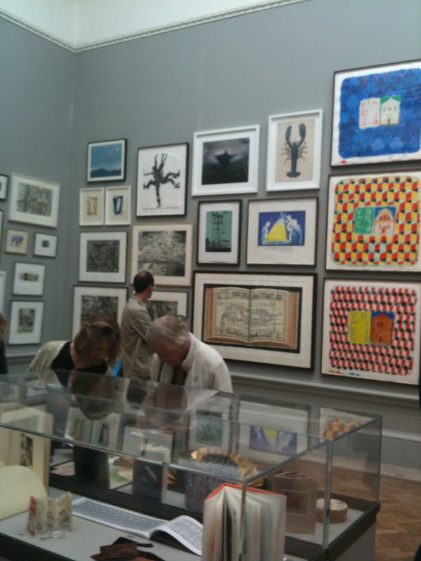
For the first time, I believe, the paintings this year have been hung off 'the line'.  Traditionally, 'the line' is the eye height of the average visitor (I imagine somewhere between 5'6" and 6' tall) and is the most prestigious spot to have your picture hung.  In the past, much butt-hurt has been caused by paintings being hung either above or below 'the line', so important has this been.  But this year 'the line' has been transformed into a wave, as you can sort of see in the two pictures below.  I hadn't noticed until just now that the walls have been painted grey, rather than the more usual maroon or dark green, but it doesn't detract from the paintings at all.

The paintings are also less crammed in than normal and while the galleries are still busy, they're not nearly so frenetic, and you don't have to crane your neck back to see the pictures at the top.  I thought it was a massive, massive improvement.  You can also see how much easier it is to actually view the paintings without there being so many people in the way - the galleries were airy and cool, which made for an infinitely more pleasurable viewing experience.

Bear in mind that I have no zoom function on my iPhone camera but if you click the image, embiggening will occur.  I liked so many artworks at this exhibition, far more than in previous ones, and this was the first one that caught my eye - it's an overgrown shed under stormy skies, called 'The Last Retreat' by Lee Madgwick.  I can't say exactly why I like it - I'm a bit of a sucker for hyperrealism in paintings and although this isn't hyperrealist, it just clicked for me.  He had another in the show of an abandoned house with a well-kept garden - it's the first image you see on his website.

In this grouping, I liked the one at the top which has a cut out silhouette in the middle - 'Aldeburgh I - The Scallop' by Anthony Green RA, it'll set you back a cool £12,000.

I really liked this piece, 'Portobello Harbour' by Francis Matthews, not least because it reminded me very much of a photograph (currently pinned to the wall) I took back in the mid-80s while sitting in a car under a railway arch in Clapton, one rainy winter night:
I loved this bright colourful picture but, sadly, haven't got any details for it:

Interestingly there was some textile art this year.  I don't recall there being anything like this at the previous Summer Exhibitions that I've attended so it was great to see them, being as how I'm a bit fond of the fibre.  This was an embroidery by Lara Punch which I liked even though it was a quite straightforward design - I've seen some truly exceptional artwork done with painted silk and embroidery, such as these hand embroidered portraits but, hey, the established artworld has to start somewhere!:
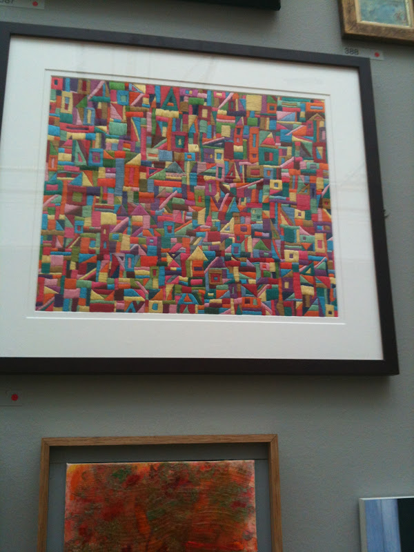
And this was called 'What Remains of La Contessa' by Lynne Brackley and was the top half of an Elizabeth costume knitted over a frame of wood and metal:

I liked this image of a handaxe, mostly because it resonated with my previous life as an archaeologist.  It's been painted on a sheet of aluminium and is called 'Milestone' by Benjamin Clarke:
In this next grouping I particularly liked the picture at the top in the middle.  It's called 'History Paintings: Jones Gallery, Victoria and Albert Museum #1' by Kevin Leathem.  If you click on the photo and have a good look, you'll see that the artist has painted the marks and repairs on the beige gallery wall - polyfilla, etc. - and just a corner of another painting:

In this group I was rather taken with the bright pink one that looked a bit like an alien.  Called 'Polypolyphemous', it's by Jennifer Harding:

Tracey Emin has got herself a nice little earner going here; this year she's put in three prints and one large painting.  I'm very, very undecided about our Tracey - most of her stuff I do not like at all, but I do have a soft spot for her bird pictures and the ones she does of Docket, her cat.  So I liked the bird print, 'Small and Beautiful',  that she put in this year, as did everyone else (the red dots equals a sale, at £275 a print):

And I liked it much better than the big painting, 'Upset',  she exhibited, which can be yours for a mere £165,000:

I quite like Michael Craig-Martin's stuff - very graphic (as in design rather than obscenity!), with bright, flat colours, and I thought this large map he did, 'Globalisation', where all the countries are mislabelled, was interesting although I'm not sure what he was trying to say.  Pretty colours though:
This next little batch of four photos are just to show you other pictures, and get a feel for what the rooms are like.  Unfortunately I have no further information for any of them!:
Oh, except now see in this last photo above, that picture in the middle-ish column, at the bottom?  That looks like an open book?  That was utterly fabulous and I'm kicking myself that I didn't get the number or any of the details.  It looks like a Grayson Perry drawing but he's not exhibiting, so I know it isn't.  It's like a medieval anatomical drawing where the organs of the body represent the city of London.  I was having to dodge one of the stewards here but managed to take a photo of the left side of the 'book':
If you look REALLY closely, you can see in the top left plaque it says "From the library of Dr London shewing passage through the capital from it's gullet to it's arse", with a naked figure on the left, eating, labelled 'consumption', and another on the right, squatting and having a poo, labelled 'creation'.  If anyone goes to the exhibition this year, can they let me know who did this?

Also in the picture above, you can see people looking into a cabinet.  One of the items in there tickled both me and TLH.  Again, sadly, I don't have the number or the details so can't tell you much except it's a small cardboard box that has printed on the top "A daily promise - take 1 a day.  Edition 1.  *for the alleviation of daily wretchedness" and it is filled with rolls of paper - a bit like fortune cookie slips - that say things like "I will respond appropriately" and "I will read Proust":

One of things I really liked about the hanging of this particular Summer Exhibition was that, traditionally, the little prints and the 'animal corner' were tucked away in the Large and Small Weston Rooms.  This has always caused a massive bottleneck because these are where the most affordable and popular pieces are likely to be found, and it was was always absolutely horrible trying to elbow your way in and around them.  Dreadful.

This year saw some common sense.  The small pictures were scattered among all the other, larger, works - as were the photographs which have, in the past, had a room to themselves - and the Small Weston Room was given over entirely to a 25-minute trilogy of films set in Kettle's Yard, University of Cambridge by Jayne Parker, featuring cellist Anton Lukoszevieze.  The bit of the film that I saw sounded very nice, and I recorded 30 seconds of it:

The Large Weston Room featured a few larger pieces, for example, 'Chicken Chair' by Olu Shobowale, who specialises in making things out of animal bones.  Not sure that this would be all that comfortable, no matter how eye-catching.  Oh, and can you imagine how many cats you'd have to beat away with sticks?:

Behind it on the wall is a very large piece called 'Peg Painting' by Annie Morris.  This is made up of thousands of wooden clothes pegs, each with a cartoon of a naked lady on it.  It kind of reminded me of those drawings of slave ships where the slaves are shown lying on the deck so you can see how they fitted in.  Is the artist here saying women are slaves to domestic chores, I wonder?:

Also in this room was a long thin sculptural piece that was reminiscent of the Elgin marbles mixed with the Bayeux Tapestry but in 3D.  Called 'Sweetly the air flew overhead, Battle with the Unicorns No. 11' by Cathy de Monchaux, it was full of little models of men on horseback and spiky-backed dogs with banners and so forth, all in a big battle scene.  TLH didn't care for it much, but I quite liked it:

As always, there were some gorgeous etchings by Norman Ackroyd RA but I wasn't buying any of his this year:
Also in the same room as the Ackroyds there was a very large portrait of the really rather fabulous actress Tilda Swinton, 'Red but Unread', painted by her husband, John Byrne:

And in front of this, in a case, was a sculpture of the head of David, made entirely from unused matches - 'David (No. 3 of 8)' by David Mach RA:

David Mach was the artist who made the enormous gorilla out of coat hangers that I wrote about in my 2010 Summer Exhibition post and, this year, he's also contributed a life size cheetah also made out of coat hangers.  It's called 'Spike' and will set you back £170,000 and catch on all your jumpers:

Other pictures that I liked that I failed to get any details of are -

An arctic seascape:

Reflections in the water:

I like the red mistiness of this picture - could be a cityscape through early morning polluted mist, hard to tell, but it's dead atmospheric, almost like the start of Blade Runner:

Similarly, I love the light in this middle picture:


In this room, though, I was charmed by this painting of two dogs looking out of windows ('The Underdog' by Oliver Canti): 

And I also liked this painting of an abandoned car slowly being overgrown, another realist picture ('Sleep No. 2' by Covadonga Valdes):

This large robot-like skeleton was particularly eye-catching but, again, I have no details for it:

And I just loved the colours in this huge painting - as must have the Royal Academy itself because this is one of the paintings you can buy a postcard of in the gift shop - 'Buffalo Grill' by Jock McFadyen):

And then there was this bin.  It was placed in such a location that it probably was a bin.  Or maybe it wasn't.  As I approached it, I noticed a well-dressed, besuited middle aged gentleman (the kind who is probably a solicitor) looking down at it.  I stood next to him.  His shoulders were shaking with laughter.  We looked at each other.  We looked back at the bin.  We looked back at each other.   I said to him, "Surely not?"  He said, "Indeed it is - apparently it's a self portrait" and he started laughing again, "...and it's £26,000!".  I said, "Just fancy, you could keep it in the kitchen and put your rubbish in it!".  We laughed a lot.  I guess you had to be there.  But, really, even if this is made from painted bronze and is by a Royal Academician, would YOU pay £26,000 - more than the price of my first flat - for this (and if you would, then I've got this bridge you might be interested in):

There's always one room that's dedicated to architectural drawings and models.  I often find this room overwhelming and, frankly, you can spend as much time in here as in the rest of the exhibition combined if you wanted to have a proper look at absolutely everything so I'm afraid I did just rather swan through here until TLH pointed out this metal hedgehog thing with fibre optics sticking out of it that changed colour.  This is obviously something conceptual but I would be intrigued to see it built, although I don't necessarily like it all that much ('Neuron Pod for Queen Mary University' by Will Alsop RA):

Onwards into the next room then.  The middle of this particular room had lots of small sculptural pieces, and some bigger ones, set on plinths and on the floor.  I understand it must be challenging to display this particular sort of item effectively but I don't think this worked.  It was odd - it reminded me too much of a charity shop, or a jumble sale.  This slightly out of focus photo will show you what I mean (I had to take it quickly, I hid the red-shirted Gallery Steward from my view by positioning the pink crocodile with maiden between us so I only had seconds to take these two pictures):


The next room after this is the one where they've often put the photographs in the past but, as I mentioned above, this year the photos were scattered throughout the rest of the rooms.  There were some big pieces in here, including one that was comprised of a series of gold squares with a representation of a boy's head on the central one, with branches sticking out of his head.  As you do. I did like the swirling wooden sculpture, though:


After this there was another gallery that had some brightly coloured sculptures, and also some carved and polished granite shapes.  There were some 3D geometrical ones in pink and grey granite (you can just see them to the right of TLH's legs in this picture).  I could imagine barking your shin on them would get old very quickly:

Although I did like the swirly flat granite shapes that had sections of different textures.  Must've weighed a tonne, though.  All the granite stuff was by John Maine RA:

And with that, we were done.  We exited through the gift shop - where I picked up a few bits and pieces - stopped off at Laduree for a box of ruinously expensive (but oh-so-delicious) macarons where I received genuine French service from the overly made-up woman behind the till who couldn't bring herself to crack even the slightest smile while she grudgingly put some of these beautifully coloured, jewel-like morsels into a box for me:
(From bottom left the flavours - 2 of each - are Lime & Basil; Blackcurrant & Violet; Strawberry & Poppy; and Salted Caramel).

By the time we got back to the car I could barely walk but we managed to avoid the rush hour and got home within about 90 minutes!

All in all, a fantastic day.  Both TLH and I agreed that this was the best Summer Exhibition that we've been to so far, and I would urge you to go if you find yourself in the neighbourhood.

Friday, 1 June 2012

Art Class 6 - Sketches of facial features

Thank God, back on more familiar turf for this week's class.  Kim asked us to bring in close up pictures of eyes, noses, mouths and ears so that we could do more detailed sketches in various media (if we wanted).

I should point out that each class is 2 hours but there's often 10 minutes at the start where Kim discusses what we're to do, and a coffee break halfway through that's probably about 20 mins long, perhaps longer.  So we're only actually working for about 90 minutes which, in the scheme of things, isn't terribly long, especially if you've become deeply engrossed.

Anyway, back to this class.  I prepared by heading off to Google images again and printed off a selection of body parts.  I chose 3 different eyes, including an elderly one (for the wrinkles and stuff); 3 different noses - a big, old man's conk, Barbra Streisand's and Posh Spice's; 3 different mouths - a woman's, a man's and a baby's.  I figured I'd decide on the day which of these I'd choose to draw and, if there was time, to do more than one of each.  I'd completely forgotten about the ears!

This class was pretty straightforward, we were just to do more detailed drawings in our chosen media so, of course, I chose pencil/graphite stick.  I really should push myself out of my comfort zone more and try and get to grips with colour but I'm a coward.

I'm pleased with the results.  It seems I can do profiles and I can do individual body parts but put them all together and it just looks like an inept medical experiment.

These are the eyes I chose:


And I decided to go with the top one as there was some very nice shadows going on there:


Next was the nose.  This was the one I chose, the big ol' conk:


Which came out like this:


We next had to do an ear and I realised my problem so Kim offered to model hers for a very quick five minute sketch:


Finally, a mouth.  I decided to go with the baby's mouth as it was so plump and squishy and a more interesting shape than the other two I'd picked:


This is how it came out:


All in all, I'm pretty pleased with how they've come out.

Next week is half term, after that there's only 3 or 4 weeks left and we've got to spend them all doing a portrait of someone.  This means that we have to persuade someone to sit for us (not in class, I hasten to add!  There's 14 of us and if we all brought in a model, we wouldn't fit in the room!).   The idea is to take photos and work from them.  I've already decided that The Lovely Husband is going to have to be my model and I quite fancy doing a portrait of him asleep, seeing as that's how I see him most of the time.  But, then again, maybe I should have him facing the window and I can do a profile instead.  I think I'll just have to take a selection of photos and decide which pose I want to use.

Then there's the thorny question of what media to use.  Kim would like us to use colour, i.e., acrylic paints or pastel, but I think we all know how I feel about me using colour.  She did suggest I might like to do a black and white picture, which is a thought, but I'll have to think about it.  It's a bit daunting because, obviously, I want to do something good but me and colours just don't mix very well.

And that's a hell of a First World problem to have, isn't it?

Art Class 5 - Pastels

I'm only putting this post in here because otherwise I'll be one short.  But there are no photos with this post.  Oh dear God, no, there isn't.

This was a self-portrait class using pastels.  I didn't have particularly high hopes for this because (a) I'm rubbish at drawing faces unless they're in absolute profile and (b) I just can't get to grips with colour, so this class was always going to be difficult.

We had to bring in a mirror and position it so that we could see ourselves while working at our easels.

Pastels are, apparently, a quick way to add colour to drawings.  You put blocks or stripes or blobs of colour on the paper and then blend them with your finger to get new colours, etc.  That's the general idea, anyway.

My pencil drawing of myself made me look like an alien.  Noses are a fucking bastard to draw - I managed to make mine look like a drainpipe with a pig's snout sticking out the end.  Really.  And, no, I'm not showing you.

'Oh well,' I thought, 'I knew this was going to be a hell of a challenge and we haven't even started with the damn colour yet'.  Our tutor wanted us to put in all the colours.  And I mean ALL the colours.  I knew exactly what she meant - if you look carefully at skin tones, in light and in shade, you can see greens, yellows, purples, blues.  I just decided to be brave and slap that colour on there.

I ended up looking like a pig-nosed alien wearing Worzel Gummidge's hair and suffering from a debilitating case of eczema.  Who's just been a victim of domestic violence.

And, no, I'm not showing you.

By way of mild compensation, this is my view of the classroom.  I realise it's not much but try to gain what comfort you can from it and be grateful you're not looking at the horror that I 'created':


The next class was much better.

PS.  It's just dawned on me that if I'd been Stella Vine, my self portrait could have been bought by Charles Saatchi...

Art Class 4 - profiles

For this class, Kim (our tutor), asked us to bring in a picture of someone in profile to draw.  It had to be absolutely in profile, like a silhouette, and not slightly turned.  I couldn't find a suitable picture in my photo files, nor in my brother's photos so resorted to a Google image search on 'profile'.  Surprisingly hard to find one that was properly in profile, but I found this.  Apparently his name is Colin.  I have no idea who he is but I've drawn him anyway:


Anyhow, the principle of drawing a profile is also based on eggs.  In this case you again draw an upside down egg but make sure it's a bit more over to one side of the paper.  On top of this you draw another egg, exactly (eggzactly? sorry) the same size but horizontally, overlapping with the top of the first egg, with the pointy end sticking out the back.  I'll show you what I mean (the first 4 pictures here I've just done quickly, the ones after that were taken during the actual class once I realised that I was quite pleased with how it was coming out and it dawned on me I might want to do a blog post, so that's why the first 4 are a bit different to the rest of them!).

So, draw an upside down egg, slightly off to one side of the paper:


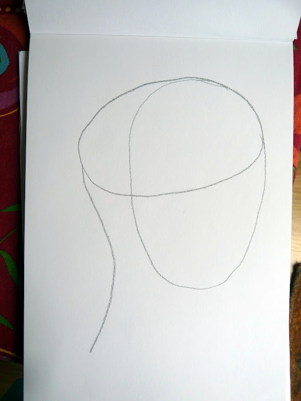
Then draw another egg, horizontally, over the top of that:


Next, draw in the neck coming down from the pointy end of the horizontal egg:


See how it's roughly taking shape?  Next you do the same thing as for forward-looking faces.  Halfway down the first egg, but on the right hand side and curving, draw a line for where the eye will go.  Halfway below that, do the same for the nose and again, below that, for the mouth:


 (The rest of the pictures from here on were taken during the class but on my iPhone so there's some vertical lines on some of them from somewhere).  So now you start to add more detail, such as the jaw line, eye, nose, chin and mouth:


Then add the ear and eyebrows.  I'm starting to darken the lines here, and I adjusted the jawline:


Our tutor wanted us to concentrate next on skin tone - shading - to start indicating contours and shadows, etc., which will make the image more three dimensional.  You'll note I've adjusted the jawline yet again:

 This was all drawn using the graphite stick and then getting my fingertips in there and smudging away like fury.

This is the final version, well, I say 'final' the hair isn't quite finished yet but I think you get the idea.  I'm pretty pleased with it, there's a resemblance to 'Colin' but, in fact, his chin sticks further out and his forehead is further back so his actual face is more vertical than what I've drawn but I don't think it's at all bad for a first attempt:


Art Class 3 - Facial proportions

Okay, I've shifted my lazy arse and sorted out the photos for the art class posts that I've missed doing.  You lucky people.

So, class 3 was about drawing faces, front on, and getting the correct proportions.  There is a template that you use, the proportions for which work pretty much with every face; the positioning and distance between the different facial elements - eyes, nose, mouth, eyebrows - are standard(ish) for everyone.  It's just ears that are contrary and can roam around the side of the head, from person to person.  I'll just leave you with that imagery.

Of course, this is just a bog standard template and once you've sketched it in you have to tailor it and fiddle around with it so that it starts to look more or less like the face you're trying to portray.  The eyes might be slightly further apart, the nose might be wider or narrower, the mouth bee-stung and pouty, or wide and grinny.  Chins will be different.  Jawlines will vary.  Eyebrows might be huge Gallagheresque monobrows or non-existent.  These are the elements that denote personality and will be individual to the person you are drawing.

But the basic proportions will be the same and the template will give you a starting point.  And it all begins with an egg.

In the pictures below I'm using an A4 sketching pad and a graphite stick (which is, like, the biggest fuckoff pencil lead you've ever seen - I'm coming to like them a lot), and then my final drawings are a mixture of graphite stick and very soft pencils - 8B or 9B ones, and I do a great deal of smudging with my fingertips, but you'll see these in later posts.

Let's get started, shall we?

Get your drawing pad and draw a large upside down egg.  It doesn't need to be perfect, this is just to give you a rough idea:


Then you either imagine or - in this case, draw - a vertical line right through the middle:


Next, you draw a horizontal line more or less exactly halfway up:


Believe it or not, this is the eye line.  The pupils - the centre of the eye - sits on this line.  Eyes are much lower down the face that you might think.

Next you draw a horizontal line exactly halfway down the bottom half of the egg:


This is where the bottom of the nose/nostrils sit.

Next, draw another horizontal line exactly halfway between the nose line and the bottom of the egg:


This where the centre of the mouth lies.

Can you see how it's starting to make sense and is beginning to look like a face?

Now, you can put in the pupils of the eyes and these lie, more or less, above where the mouth ends.  Of course, in the final drawing this will all depend on the width of your sitter's mouth, which direction their eyes are pointing, but you get the idea.  I've added some dotted lines to show you how everything lines up:


The outer edges of the line showing where the nose is, more or less, line up with the inner corner of the eye:


I've included the irises here.  Again, depending on your subject's face, you may need to adjust all these, but this gives you a rough guide.

The outer ends of the nose line not only line up with the inner corners of the eyes but also the beginning of the eyebrows:


Ears, as I said, tend to wander around so just for the purpose of this template, I've added an ear that starts at eye level:


And there we have it.  The rough proportions of the human face.  From this you then add all the other details and hope to God you end up with something recognisable.  Which is more than I could do so I'm not going to show you my final drawing.  Trust me, you wouldn't want to own up to it either!

Next up - how to draw profiles.

Wednesday, 30 May 2012

Beantastic!

Back on 1 April, I posted asking for suggestions where I could plant my broad bean and pea seedlings that were originally intended for my allotment but now had to go into my garden.

One of my readers, Sue, came up with a brilliant suggestion - get hold of some growbags, hold them up by their middles so they flop down into two halves, cut along half the plastic folded in the middle and, voila, you have two smaller - but deeper - containers made from one bag.  Genius.

So that was what I did, and found a patch of space where they would fit.  I planted them up a few weeks ago, before the rains came, which they enjoyed, and then the sun came, which they enjoyed even more.  Many, many, many flowers have been produced and if the bees have found them then, hopefully, we'll shortly see the start of the bean pods developing.

In fact they've grown so leggy that yesterday I had to dig out some small bamboo canes (some of which I'd grown myself!) and tie them up as they were flopping all over the place. 

This is what they look like now (clicky for embiggening):

This is a variety called 'Masterpiece Green' which grows quite tall, produces lovely flavoured broad beans and, most importantly, seems to be blackfly resistant.  I don't think it's marketed as being so, but I grew them last year and there were hardly any; the ones I'm growing so far this year also seem to be blackfly free and if you've ever grown your own broad beans, you'll know just how disgusting it is handling pods that are covered with the little buggers.  So I highly recommend this particular variety.

Next to the broad beans and not in growbags but just ordinary pots are my sugar snap peas:

I've crammed quite a few plants in each of the three big pots so I don't know how they'll do.  They're just starting to develop flowers so I might get one or two pods off them.

While I'm here, I thought I'd show you my blueberry bushes as well (and, no, that's not a euphemism for anything).  I dug these out of the ground at the allotment and brought them home with me as they weren't especially cheap plants to buy in the first place and I didn't want to leave them there.  I found the biggest pots I had to transport them home and they've just sort of stayed in them but, having said that, they seem to be doing pretty well.  I have three bushes - an early, middle and late variety - and I had a few berries off them last year but it looks like I'll have a lot more this year:

All those white flowers will hopefully turn into berries.  You can just see them starting to develop on this other plant:


All in all, I'm pretty pleased that my beans and peas seem to be coming along, and that the blueberries don't seem any the worse for wear for having been ripped out of their comfy home, stuck in a cramped container and bunged beside a fence and under a tree.  Which was lucky!

Still here, just being lazy....

Oops.  Again a long gap between blog posts.  Sorry 'bout that.  I have a natural tendency to generally try and do as little as possible and while I have these great ideas about blog posts I want to write, something happens on the journey from my brain to my fingers that results in me going 'oh fuck it, I can't be arsed'.

Which is not really good enough, is it? *hangs head in shame*.

For example, I'm three posts behind on my art classes.  I promise I'll catch up because the teacher is showing us techniques for drawing stuff that, I believe, are pretty standard but which you won't know about if you don't take classes or read any sort of 'How to draw' books.  And what she's been showing us have been lightbulb moments for me, you know, 'Oooh, so that's how you do it?!  Easy when you know how!!'.  However, to show you these, I have to get up off my arse, bend down to the bag I carry my art supplies in, extract the drawing pad and pencils, clear a space off the dining table, redraw the templates I've already done once so you can see what to do, find my camera, make sure the battery is charged up and if it isn't, charge it (which will take a couple of hours), take the photos, remove the SD card from the camera, stick it in the laptop, alter and adjust the photos if necessary, save them to the laptop, remove SD card and put back in camera because if I don't then next time I come to use the camera I'll panic because I can't find the card, try and find the photos again on the laptop, write the damn post.

See - faff.

Yeah, I know, it's a rubbish excuse really.  I do really want to do the art class posts because they're interesting, although I'm not showing you at least two of the pictures I did because - honestly? - my 2 year old niece could probably have done better, but I am pleased with the profile picture I did.

And then there's an update about the veggies I have growing in my back garden.  One of my long-suffering readers, the splendid Sue, dropped me an email a couple of days ago asking if I was okay because I'd not updated my blog for a while (and, yes, this has prompted me to write this particular post) and I remembered that it was she who gave me the fab tip about turning growbags into two smaller round, but deeper, bags in which I could plant up my broad beans and I should take some pics to show how well they're doing.

And then there's the new car we got, which I may or may not write about.  It's a lovely thing but I can't help thinking it's going to sound like I'm boasting about it when the country is in such dire financial straits and people are finding it hard making ends meet, when really it's just a topic for a blog post.  I'll think about it.

And then there's the post I want to write about online friends -vs- real life friends but that will involve some 'proper' thinking about stuff rather than just flummery which is so much easier to write about.  God, I'm a lazy, lazy mare.

And then there's the hiatus in my running due to weird things going on with my feet.

And then there was the first of my outdoor stalls at Churt Village Fete last weekend and what a lovely day it was.

And then there's the Jubilee coming up and what it all means, and how, while disapproving immensely of the concept of the Royal Familly, I can't help enjoying the big national spectacles that revolve around them.  But there you go, see, I almost don't need to do the post now because I've given you my opinion in that last sentence.  Still, like most places in the UK this coming weekend, where I live is pulling out all the stops and I hope to go to see some of them - especially the torchlight parade and beacon-lighting on Monday, 'cos I love a good bonfire and fireworks, me.

Plus we've got the Olympic torch passing through my little town sometime in July so that ought to be a blog post with photos.

So there's plenty to talk about, it's just me having go to the effort of actually doing it.  But I promise I'll make a start....