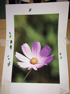
It's a little different from my previous pictures in that the focal point flower is much larger, and to the forefront of the image. I chose it because it's a nice, simple, uncomplicated shape, and the background is a better colour choice than the orange flower one.
With all my paintings, I start by using masking tape to mask off a border on an A4 sized piece of acrylic paper.
I then looked carefully at the original photo and picked on a mid olive green shade as a suitable mid tone to start with. A mid tone is the best to use because you then add lighter and darker tones afterwards.
I painted over the whole of the masked off sheet with this olive green wash, let it dry then drew the outline of the flower:
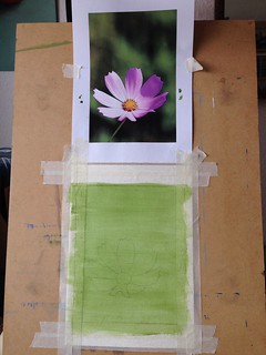
I then started working on the background, scumble glazing (i.e., dry brush technique) various shades of green. You can see where I've been testing colours on the white border of the original photo - there are nine blobs there, and I will have used about three-quarters of them in my painting at this point. But it doesn't look like there are six different shades of green in the painting, does it? That's what I mean about the amount of colour mixing and effort that goes into getting the background right!
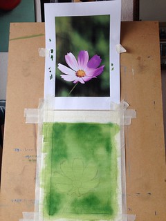
So this is it a bit further on, with more colours added, just to the background:
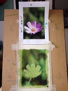
I'm now more or less happy with the background, so it's time to concentrate on the flower. In order that the green doesn't show through, I decided to paint the flower out completely white (which is actually quite effective as it is!):
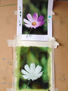
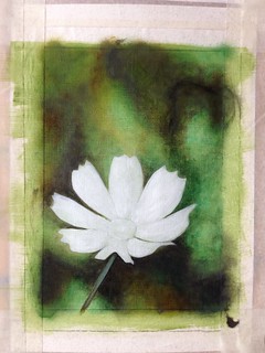
Now it's just a question of painting in the petals. Again, I started with a pretty pale mid-tone shade of pink and then added darker and lighter shades:
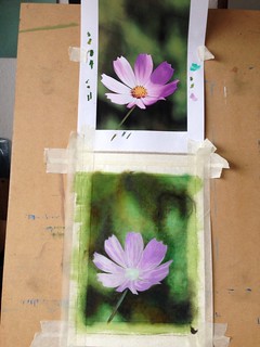
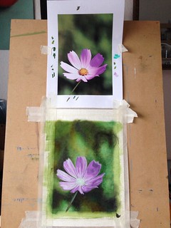
Then added the central bit where all the stamens and pollen are, etc., added darker shading where necessary, added white highlights and finally went round the edges of the petals with the thinnest black lining known to humanity:

And this is the final version, with the masking tape removed and the edges tidied up:

And I'm thrilled with it! This one turned out way better than I could have hoped for and definitely makes up for the slight disappointment of the orange flower painting.
The next painting I'm thinking about is of a tulip but I may change my mind so watch this space!!


5 comments:
Love your paintings, the latest looks really excellent. It is probably a bit late now as this is the last weekend but have you seen this http://www.soc-botanical-artists.org/exhibitions_2013.php
I went on Thursday and it is wonderful. There is the dedicated themed exhibition, examples from some of the study courses and the hundreds of works for sale. Such a lot of wonderful pictures and a great location and free to visit.I highly recommend it for this year if you can get there or take a note for next year.
Ooh, thanks for that Judith, I may well check that out next year!!
Wow looks amazing !
Belated Happy Birthday hope you had a brilliant time
M xx
PS love the new colour of your hair ! I haven't visited your blog for a while , how long ago did it change from your red hair ?
Maureen - thanks for the birthday wishes!
I've actually been blonde now for several months. Summer last year I went hot pink and in order for the colour to show, I had to bleach my hair white. The pink dye was only semi-permanent, so when it washed out, I was left with white hair so decided to keep it for the time being!!
Post a Comment